Understanding the Delivery Ratio: Separating Investor Conviction from Market Noise

Learn how to use price action, trading volume, and delivery ratio together to identify accumulation, distribution, and high-conviction market moves.

Why do some stocks rebound sharply after a steep fall, while others continue to decline?

Price and trading volume provide part of the answer, but they don’t reveal who is actually buying or selling. This is where the Delivery Ratio becomes a valuable indicator. It helps investors distinguish between short-term speculative trading and genuine investment activity, offering deeper insight into the conviction behind market moves.

Understanding Delivery Ratio

When analysing stocks, most investors focus on price movements and trading volume. While these indicators provide valuable insights, they don’t reveal the true intent behind market activity.

This is where the Delivery Ratio becomes an important tool.

The delivery ratio helps investors understand whether trading activity is driven by genuine investment interest or short-term speculation. By combining delivery ratio with price and volume analysis, investors can better judge the strength and sustainability of a market trend.


What is the Delivery Ratio?

The delivery ratio is the percentage of shares traded during a day that are actually transferred to buyers’ demat accounts for settlement.

In simple terms, it tells us how many shares were bought for holding rather than for intraday trading.

Formula

Delivery Ratio = (Deliverable Quantity ÷ Total Traded Quantity) × 100

Example

Suppose a stock trades 10 lakh shares during the day.

  • Shares traded: 10,00,000
  • Shares delivered to buyers: 7,50,000

Delivery Ratio = (7,50,000 ÷ 10,00,000) × 100 = 75%

This means that 75% of the traded shares were purchased for delivery, while the remaining 25% were likely intraday trades.


Why is the Delivery Ratio Important?

The delivery ratio provides insight into the quality of trading volume.

Two stocks may record identical trading volumes, but the one with the higher delivery ratio generally indicates stronger investor participation and conviction.

It helps investors:

  • Distinguish between long-term investing and short-term speculation
  • Identify possible accumulation or distribution by large investors
  • Confirm the strength of a price breakout or breakdown
  • Filter out false signals created by speculative trading

Interpreting the Delivery Ratio

1. High Volume + Low Delivery Ratio

A large number of shares are traded, but only a small percentage are taken for delivery.

What does it indicate?

  • Most of the trading activity is likely intraday or speculative.
  • Traders are buying and selling shares within the same trading session.
  • High trading volume may create excitement, but it does not necessarily reflect strong investor conviction.
  • Such price movements are often driven by short-term sentiment and can reverse quickly.

Example

A stock trades 1 crore shares, but only 20 lakh shares are delivered.

Delivery Ratio = 20%

This indicates that most of the day’s activity was speculative.

Key Interpretation

High trading activity + Low investor commitment = Speculative movement


2. High Volume + High Delivery Ratio

A large number of shares are traded, and a significant percentage are taken into investors’ demat accounts.

What does it indicate?

  • Indicates strong buying or selling conviction.
  • Investors are willing to hold their positions instead of exiting on the same day.
  • If accompanied by a price increase, it may indicate accumulation by institutions or long-term investors, making the uptrend more reliable.
  • If accompanied by a price decline, it may suggest distribution or sustained selling pressure.

Example

A stock trades 1 crore shares, and 75 lakh shares are delivered.

Delivery Ratio = 75%

This suggests that investors are willing to hold the stock.

Key Interpretation

High trading activity + High investor commitment = Strong conviction and a more sustainable trend


3. Low Volume + High Delivery Ratio

Trading volume is relatively low, but a high percentage of the traded shares are taken for delivery.

What does it indicate?

  • Suggests quiet accumulation by long-term investors.
  • Although overall participation is low, those buying the stock intend to hold it.
  • Often observed during the early stages of an uptrend or while informed investors gradually build positions.
  • The stock may remain range-bound until broader market participation increases.
  • If the stock later breaks out with a sharp increase in volume, it strengthens the bullish case.

Example

A stock trades 10 lakh shares, and 8 lakh shares are delivered.

Delivery Ratio = 80%

This indicates that most buyers intend to hold the stock.

Key Interpretation

Low trading activity + High investor commitment = Quiet accumulation


4. Low Volume + Low Delivery Ratio

Trading volume is low, and only a small percentage of shares are taken for delivery.

What does it indicate?

  • Reflects limited interest from both investors and traders.
  • Neither long-term investors nor speculative traders are actively participating.
  • Stocks with this combination often move sideways with low liquidity.
  • Price movements generally lack momentum until fresh buying interest emerges.

Example

A stock trades 10 lakh shares, but only 2 lakh shares are delivered.

Delivery Ratio = 20%

This indicates weak participation from the market.

Key Interpretation

Low trading activity + Low investor commitment = Weak market interest

Disclaimer: The following case study is based on publicly available trading data and represents one possible interpretation of market behaviour. No single indicator can conclusively prove institutional buying or selling. Delivery ratio should always be analysed alongside price action, trading volume, and broader market context.

Case Study : Analyzing Delivery Ratio – Healthcare Global Enterprises (HCG)
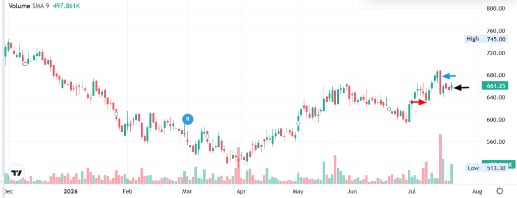
HCG Graph source : Moneycontrol.com

Red arrow – 8th July (-2.0% Price drop / Delivery 89.1%)

Blue arrow : 15th July (-5.8% Price drop / Delivery 86.7%)

Black arrow : 21st July (Delivery 94.4%)

How Delivery Ratio Revealed Institutional Accumulation

The table below shows the relationship between price movement, trading volume, and delivery percentage over multiple trading sessions.

DateClosing Price (₹)Day Change (%)Traded QuantityDelivered QuantityDelivery (%)VWAP (₹)
21 Jul 2026661.25+1.1%9,73,1999,18,32294.4%655.65
20 Jul 2026653.70-0.3%68,74939,79057.9%655.78
17 Jul 2026655.85-0.6%75,51144,22258.6%655.88
16 Jul 2026660.10+2.0%6,35,8805,47,49286.1%
15 Jul 2026646.85-5.8%19,51,00016,91,51786.7%
14 Jul 2026686.35+1.1%1,38,00877,04755.8%682.69
13 Jul 2026678.85+1.9%1,48,46484,65757.0%676.38
10 Jul 2026666.40+2.1%2,80,6341,71,32061.0%665.20
09 Jul 2026652.70+2.9%1,12,11058,29752.0%
08 Jul 2026634.50-2.0%5,67,3905,05,54489.1%
07 Jul 2026647.65-0.8%4,07,0403,32,55181.7%
06 Jul 2026652.60-0.3%74,84040,48854.1%
03 Jul 2026654.80+0.9%1,14,87069,15160.2%
02 Jul 2026649.00+2.4%2,12,7601,19,14556.0%

Key Takeaways From the Data:

One trading day stands out:

DatePrice ChangeTraded QuantityDelivery %
15 Jul 2026-5.8%19.5 lakh shares86.7%

At first glance, many retail investors would consider this a bearish signal because the stock witnessed a sharp fall of nearly 6%.

However, a deeper analysis tells a different story.


Looking Beyond the Price

A sharp decline accompanied by very high trading volume usually attracts attention.

Many retail traders interpret this as a breakdown and panic sell.

Professional investors, however, often view these situations differently.

Periods of panic selling create liquidity—allowing institutions to accumulate large quantities of shares without significantly pushing prices higher.


Why This Data Suggests Accumulation

On 15 July, the stock experienced:

  • Sharp price correction (-5.8%)
  • Exceptionally high trading volume
  • Very high delivery percentage (86.7%)

The high delivery percentage indicates that most of the traded shares were actually transferred to investors’ demat accounts rather than squared off as intraday trades.

This suggests that buyers were willing to hold the shares despite the sharp fall.

More importantly, the subsequent trading sessions strengthen this interpretation.

Following the decline:

  • Delivery percentages remained consistently high.
  • The stock stabilized near the ₹645–₹655 zone.
  • Within a few trading sessions, the price recovered to ₹661.25, while delivery percentage increased further to 94.4%.

This combination suggests that the selling pressure was gradually absorbed by committed buyers.


Institutional Buying Often Happens During Fear

Institutional investors rarely chase stocks after a strong rally.

Instead, they often prefer buying during periods of fear when liquidity is abundant.

Rather than placing aggressive market orders, they may place large passive buy orders around important support levels.

As panic sellers exit, institutions quietly absorb the available supply.

Once the excess selling pressure is exhausted, prices often stabilize and recover.

This appears consistent with the pattern observed around the ₹645–₹655 price zone in this example.


Key Learning

A falling price combined with a high delivery percentage does not automatically mean a stock is bullish.

Instead, it indicates strong conviction among market participants.

To determine whether it represents accumulation or distribution, investors should analyse:

  • Subsequent price action
  • Trading volume
  • Delivery percentage over several sessions
  • Key support and resistance levels

In this case, the subsequent recovery in price and consistently high delivery percentages support the view that the decline was likely an accumulation phase rather than a continuation of bearish momentum.


Investor Takeaway

Price tells you what happened.

Volume tells you how much activity took place.

Delivery ratio tells you how much of that activity resulted in actual ownership.

When all three indicators are analysed together, they provide a much clearer picture of market sentiment than any one indicator alone. This is why experienced investors use the combination of price, volume, and delivery ratio to distinguish between panic selling, speculative trading, accumulation, and distribution.


Quick Takeaway

ScenarioWhat It SuggestsInvestor Focus
High Volume + High DeliveryStrong investor convictionConfirm trend with price action
High Volume + Low DeliveryMostly speculative activityBe cautious of false breakouts
Low Volume + High DeliveryQuiet accumulationMonitor for volume expansion and breakout
Low Volume + Low DeliveryWeak market interestAvoid until participation improves

Important Points to Remember

  • A high delivery ratio does not always guarantee that the stock will rise. It simply indicates stronger holding interest.
  • A low delivery ratio does not always imply weakness. It may simply reflect active intraday trading.
  • Always interpret the delivery ratio in conjunction with price movement and trading volume.
  • The delivery ratio is most useful when analysed over multiple trading sessions, rather than a single day.
  • Compare the delivery ratio with the stock’s historical average to identify unusual accumulation or distribution.

Common Mistakes Investors Make

  • Assuming a high delivery percentage is always bullish.
  • Looking at only one day’s delivery data instead of analysing multiple sessions.
  • Ignoring price action while interpreting delivery.
  • Ignoring overall market trend.
  • Taking trading decisions solely based on delivery ratio.

Delivery Ratio Checklist

Before taking a trading or investing decision, ask yourself:

✅ Is the stock trading near an important support or resistance?

✅ Has volume increased significantly?

✅ Is the delivery ratio above its historical average?

✅ Is price confirming accumulation or distribution?

✅ Is the broader market supporting the move?

If the answer is Yes to most of these questions, the delivery ratio provides much stronger confirmation.


Final Thoughts

Successful investing isn’t about relying on a single indicator—it’s about combining multiple pieces of evidence.

  • Price tells you where the market is moving.
  • Volume tells you how much participation there is.
  • Delivery Ratio tells you how much conviction exists behind that participation.

When all three point in the same direction, investors gain greater confidence in identifying accumulation, distribution, breakouts, and potential trend reversals.

“Price creates the story, Volume gives it credibility, and Delivery Ratio reveals the conviction behind it.”

Use the delivery ratio not as a standalone signal, but as a confirmation tool alongside price action, trading volume, support and resistance, and broader market trends. Over time, this disciplined approach can help you make more informed and confident investment decisions.
Understanding the Importance of Trading Volume in Stock Analysis

While analyzing stock price movements, the primary focus is usually on price action. However, trading volume is equally important because it validates the strength and reliability of a price move.

Volume refers to the total number of shares traded on the stock exchange during a particular trading session.

Why is Volume Important?

1. Trend Confirmation

Volume confirms the strength of a price trend. A rise in price accompanied by increasing volume indicates strong buying interest, making the trend more reliable.

2. Breakout Confirmation

When a stock breaks above a key resistance level on high volume, it confirms strong market participation. Such breakouts are more likely to sustain than those occurring on low volume.

3. Breakdown Confirmation

When a stock breaks below a key support level on high volume, it indicates strong selling pressure. High-volume breakdowns are generally more reliable and often signal further downside, while low-volume breakdowns are more prone to failure.


Interpreting Volume in Technical Analysis

1. Bullish Trend Confirmation – Rising Price on High Volume

  • Indicates strong buying interest from investors and traders.
  • Confirms that the uptrend is supported by conviction and is more likely to continue.
  • High trading volume validates the breakout, increasing the probability of a sustained uptrend.
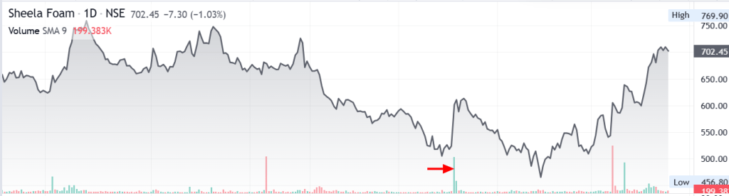
High volume confirms the breakout, increasing the probability of a sustained uptrend
Graph source: Moneycontrol

2. Bearish Volume Divergence – Rising Price on Low Volume

  • Indicates weak buying participation despite rising prices.
  • The rally lacks broad market participation and institutional support.
  • The price may continue rising temporarily, but the move is less reliable and more vulnerable to a reversal.

Interpretation:
Ideally, rising prices should be accompanied by increasing volume. When prices rise while volume remains low or declines, it is known as bearish volume divergence, signalling that the uptrend may be losing strength.

3. Bearish Trend Confirmation – Falling Price on High Volume

  • Indicates strong selling pressure as investors and traders exit the stock.
  • Confirms that the downtrend is supported by conviction.
  • High selling volume validates the breakdown, increasing the probability of further downside.
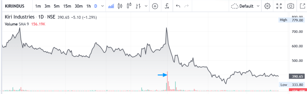
High selling volume confirms the breakdown, increasing the probability of further downside
Graph source: Moneycontrol

4. Bullish Volume Divergence – Falling Price on Low Volume

  • Indicates limited selling interest despite falling prices.
  • The decline lacks strong selling conviction.
  • Selling pressure may be weakening, increasing the possibility of price stabilization or a reversal if buyers return.

Interpretation:
When prices fall while trading volume decreases, it is known as bullish volume divergence. This suggests that sellers are losing momentum and the downtrend may be approaching exhaustion. Traders often wait for additional confirmation before expecting a reversal.

Key Takeaway

Price tells you what is happening. Volume tells you how strongly the market believes in that move.

A price move supported by high trading volume is generally more reliable than one occurring on low volume. Successful traders combine price action and volume analysis to:

  • Confirm market trends.
  • Validate breakouts and breakdowns.
  • Identify bullish and bearish volume divergences.
  • Avoid false trading signals.

Golden Rule

Price shows the direction. Volume confirms the conviction.

Rethinking the Rule of 100: A Modern Approach to Investment Risk

Rethinking the Rule of 100

A Story to Begin With

Two investors walk into the same financial planning office.

The first is 28 years old, earning a decent salary but juggling a home loan, car EMI, and plans for a child’s education. The second is 62, recently retired, debt-free, with accumulated savings and a steady pension.

According to the Rule of 100, the younger investor should aggressively invest in equities, while the older one should sharply reduce stock exposure. But when you look at their real financial lives, the picture feels counterintuitive. The younger investor cannot afford large losses, while the retired investor may actually have the stability to ride out market volatility.

This disconnect raises an important question:
Should age alone determine how much investment risk you take?

That question sits at the heart of this article.


The Rule of 100 – Asset Allocation by Age

When it comes to investing, one of the most common questions people ask is:
How much should I invest in equities and how much in safer assets?

To simplify this decision, financial planners have long relied on age-based formulas—the most popular being the Rule of 100.

At first glance, the rule seems logical and easy to follow. But does it truly reflect how real people earn, save, and spend today? Let’s take a closer look.


What Is the Rule of 100?

The Rule of 100 is a basic guideline used to determine asset allocation based on age.

Formula:
100 − Your Age = Percentage of your portfolio invested in equities

The remaining portion is allocated to bonds, debt instruments, or other relatively low-risk assets.

Simple Examples

  • Age 30
    • 70% in stocks
    • 30% in bonds/debt
  • Age 50
    • 50% in stocks
    • 50% in bonds/debt

The Logic Behind the Rule

The rule is built on a straightforward assumption:
risk tolerance declines with age.

Younger investors are expected to have:

  • Longer investment horizons
  • More time to recover from market downturns

Older investors, on the other hand, are assumed to:

  • Prefer stability over growth
  • Focus on capital preservation and steady income

This thinking made sense decades ago—but markets, careers, and lifespans have changed.


Why the Rule Evolved: Rule of 110 and Rule of 120

As life expectancy increased and inflation became a bigger threat, financial advisors began adjusting the formula.

Rule of 110

110 − Age = Equity allocation

  • Age 30 → 80% equities
  • Age 50 → 60% equities

This version recognizes that:

  • People are working longer
  • Retirement needs are larger
  • Equity growth is crucial to beat inflation

Rule of 120

120 − Age = Equity allocation

  • Age 30 → 90% equities
  • Age 50 → 70% equities

This rule is typically suggested for investors with higher risk tolerance or those relying heavily on equity markets for long-term wealth creation.

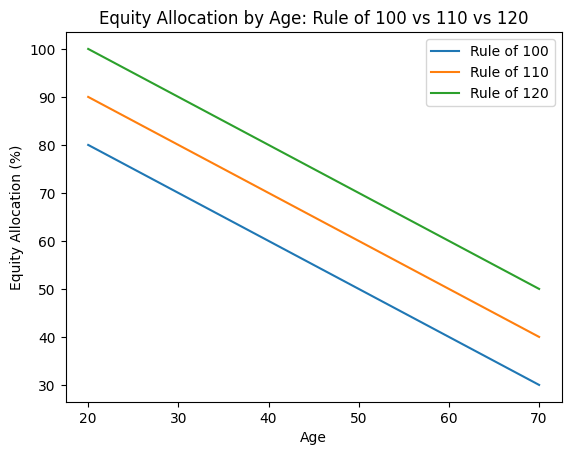
A comparison of Rule of 100 vs Rule of 110 vs Rule of 120 is shown in the chart below:

What the Chart Shows

  • X-axis: Investor age
  • Y-axis: Suggested equity allocation (%)

Three declining lines represent:

  • Rule of 100 (most conservative)
  • Rule of 110 (moderate)
  • Rule of 120 (most aggressive)

Key Takeaways:

  • All three rules reduce equity exposure linearly with age
  • The difference between rules becomes more pronounced at younger ages
  • Even at age 60–70, Rule of 120 still suggests meaningful equity exposure, reinforcing the inflation-risk argument

The Big Problem With All These Rules

Despite their popularity, the Rule of 100, 110, and 120 share one major flaw:

They assume age alone determines risk capacity.

In reality, age tells only part of the story.


A Contrarian Perspective: When the Rule Breaks Down

Younger Investors Aren’t Always Risk-Takers

Many young investors face:

  • Lower incomes and limited savings
  • Home loans, car EMIs, and education expenses
  • Small emergency buffers

For them, a sharp market fall can cause real financial stress. Even though time is on their side, their ability to absorb losses may be limited. In such cases, aggressive equity exposure can do more harm than good.

Older Investors May Have Higher Risk Capacity

Ironically, many older or retired investors:

  • Are free from major financial obligations
  • Have accumulated wealth, pensions, or rental income
  • Can emotionally handle short-term volatility

For them, maintaining meaningful equity exposure may actually be necessary to protect purchasing power against inflation.


The Real Question: Risk Tolerance or Risk Capacity?

This is where most age-based rules fall short.

  • Risk tolerance is how comfortable you feel with volatility
  • Risk capacity is whether your finances can survive a downturn

Risk capacity depends far more on:

  • Cash flows
  • Liabilities
  • Financial security
  • Emergency reserves

—not just your age.


Final Thoughts

The Rule of 100 and its modern variations are useful starting points, not formulas to follow blindly.

Smart asset allocation requires balancing:

  • Age
  • Income stability
  • Financial responsibilities
  • Long-term goals
  • The ability—not just the willingness—to take risk

In investing, simplicity helps.
But context matters even more.


What Do You Think?

  • Should age alone determine how much risk an investor takes?
  • Have your financial responsibilities increased or reduced your ability to invest in equities?
  • For younger investors with EMIs, is aggressive equity allocation practical—or risky?
  • Should retired investors reduce equity exposure simply because of age?
  • Which matters more: risk tolerance or risk capacity?
  • Do you follow the Rule of 100 (or 110/120), or have you created your own approach?

👉 Share your views—your experience may help others rethink how they invest.


The Magnificent 7: Are AI Stocks Setting Up for a Bubble?

Overview

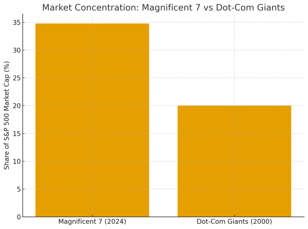
As of late 2024, the Magnificent 7 — Alphabet (Google), Amazon, Apple, Meta Platforms, Microsoft, Nvidia, and Tesla — collectively account for $16 trillion of the S&P 500’s $46 trillion total market capitalization.
This means these seven companies alone represent 34.8% of the entire index, a massive increase from about 10% in 2014.

For historical context, even during the dot-com bubble of 2000, the largest tech companies never exceeded 20% of the S&P 500. Today’s concentration level is therefore unprecedented.

Over the recent years, the heavy weighting of AI-focused companies has been a major driver of the S&P 500’s growth. This dependence has led many analysts to warn of a potential AI-driven valuation bubble and the risk of a sharp correction if expectations disappoint.

Risk of an AI Bubble Bursting

1. Valuation Risk

AI-focused companies are increasingly trading at valuations that far exceed their underlying fundamentals, echoing patterns seen during the Dot-Com era. For example, Palantir reported $1.18 billion in Q3 2025 revenue and is projecting around $4.40 billion for the full year. Yet its market capitalisation surged to nearly $450 billion, implying a valuation of 115–120× sales—levels typically associated with speculative excess rather than sustainable financial performance. This disconnect between valuation and fundamentals heightens the risk of sharp corrections if anticipated growth fails to materialize.

Many analysts argue that valuations are pricing in hyped future revenues, not current financial performance or realistic near-term applications of AI.

2. Capex vs. Actual Returns

Big Tech is expected to invest $5 trillion on AI-related infrastructure — data centers, chips, model training, and energy facilities.

However, the return profile does not yet justify this scale of investment:

  • Only around 5% of businesses currently use AI in full production environments.
  • Productivity gains remain slow and uneven.
  • Many AI tools still lack clear monetization paths.

This mismatch heightens the risk that expected AI-driven profits may not materialize soon enough to justify the massive capital outlay.

3. Rising Debt Financing

Despite being historically cash-rich, AI-focused tech giants have been taking on large amounts of debt to finance data-center expansion.

For example:

  • Oracle reported $124 billion in total obligations (including operating lease liabilities) as of Nov 2025 — up from $89 billion a year earlier.
  • Weak earnings combined with rising debt prompted S&P and Moody’s to revise Oracle’s credit outlook to negative.

Analysts see parallels to the dot-com era, when companies overborrowed to fund speculative, unproven technologies. If AI revenues lag, these debt loads could rapidly become unsustainable.

4. “Circular” Investment and Revenue Deals

An emerging concern is the rise of vendor-financed growth loops within the AI ecosystem.

A notable example involves:

  • Nvidia, which committed up to $100 billion in staged investments into OpenAI, contingent on the deployment of new AI infrastructure (e.g., gigawatts of data-center capacity).
  • OpenAI then uses the capital to purchase Nvidia chips, creating a circular flow of investment → purchase → revenue.

Analysts and regulators have pointed out that this model may artificially inflate demand and revenue, echoing vendor-financing practices seen in earlier speculative periods.

5. Concentration Risk in the S&P 500

With the Magnificent 7 making up nearly one-third of the total S&P 500, the broader market’s stability is increasingly tied to the performance of a small cluster of AI-centric companies.

A synchronized decline in these firms — due to AI monetization delays, regulatory pressure, competitive threats, or earnings disappointments — could:

  • Trigger broad market corrections
  • Mirror the systemic tech collapse of 2000
  • Reduce retirement savings, given heavy household exposure to index funds
  • Increase volatility across global equity and credit markets

The S&P 500’s dependence on a single technological narrative — AI dominance — heightens systemic vulnerabilities.


Summary

The rapid rise of AI has created unprecedented concentration within the S&P 500. While AI has transformative potential and the Magnificent 7 possess stronger fundamentals than the tech leaders of 2000, valuation excesses, massive capex commitments, rising debt, circular revenue arrangements, and extreme index concentration have raised concerns about a potential AI bubble.

If AI growth and monetization fall short of current expectations, the resulting correction could echo — or potentially exceed — the impact of the dot-com crash.

How to use RSI for Trading Success

Relative Strength Index (RSI)


A momentum indicator developed by J. Welles Wilder Jr. (1978) that measures the speed and magnitude of price changes. Traders use RSI to identify whether a stock is overbought or oversold.

RSI Scale

RSI moves between 0 and 100.

RSI Formula (Simple Version)

  • RS = Average Gains / Average Losses
  • RSI = 100 – [100 / (1 + RS)]

(You don’t usually need to calculate it manually—charting tools do it automatically.)

How to Read RSI

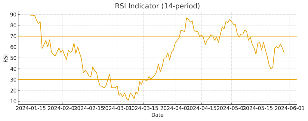
Overbought (RSI > 70)

  • An RSI above 70 suggests that the asset may be overbought, indicating a potential price correction.

Oversold (RSI < 30)

  • An RSI below 30 suggests the asset may be oversold, indicating a possible rebound.

Example Chart Explanation

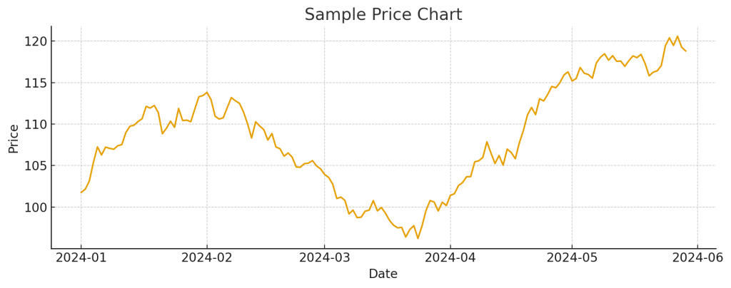
1. Price Chart

(shows the stock’s price movement over time.)

2. RSI Chart

(shows RSI oscillating between 0 and 100 with reference lines at 30 and 70.)

Overbought Example

When RSI rises above 70:

  • Momentum is strong but may be overstretched.
  • When RSI turns back below 70, the price often slows down or pulls back.

Oversold Example

When RSI falls below 30:

  • Indicates strong downside pressure.
  • When RSI rises above 30, price often stabilizes or rebounds.

How Traders Use RSI

  1. Entry Signal (Buy) : RSI crosses above 30 → possible buying opportunity.
  2. Exit Signal (Sell) : RSI crosses below 70 → possible selling signal.
  3. Trend Reversals (Divergence) Traders watch for differences between price movement and RSI movement:
    • Bullish Divergence:
      Price makes lower lows, but RSI makes higher lows.
      → Suggests a potential upward reversal.
      → Buy when RSI crosses above 30.
    • Bearish Divergence:
      Price makes higher highs, but RSI makes lower highs.
      → Suggests a potential downward reversal.
      → Sell when RSI crosses below 70.

Limitations

  • RSI can stay overbought or oversold for long periods during strong trends.
  • It may give false signals in sideways or choppy markets.
  • Works best when combined with price action, moving averages, MACD, or volume confirmation.

Conclusion

The RSI is a simple yet powerful indicator that helps traders understand momentum and identify potential turning points in the market. While it provides helpful signals for entries, exits, and trend reversals, it should not be used alone. Combining RSI with other technical tools and overall market context leads to more reliable and confident trading decisions.


Understanding Moving Averages in Trading

Moving Average (MA)

A moving average represents the average price of a security over a specific period, helping traders smooth out short-term price fluctuations and identify overall trends.

Types of Moving Averages

TypePeriod CoveredUsageTrend Focus
200-Day Moving Average (200-DMA)Last 200 trading daysLong-term trend identificationBroad market direction
50-Day Moving Average (50-DMA)Last 50 trading daysShort- to intermediate-term analysisRecent price momentum

How to Interpret a Moving Average

Golden Cross (Bullish Signal)

Definition:
Occurs when the 50-DMA crosses above the 200-DMA.

Interpretation:
→ Signals a bullish trend, indicating potential long-term upward momentum.
The crossover shows that short-term momentum is overtaking long-term averages, suggesting renewed market strength.

Confirmation:
Traders look for increasing trading volumes or other indicators (like RSI or MACD) to validate the uptrend.

Death Cross (Bearish Signal)

Definition:
Occurs when the 50-DMA crosses below the 200-DMA.

Interpretation:
→ Signals a bearish trend, indicating potential long-term downward momentum.
This suggests that short-term weakness is overtaking long-term support levels.

Confirmation:
Traders often seek validation through
• A break of key support levels
Declining trading volumes
• Other bearish indicators

Example: Golden Cross – Northern ARC Capital Ltd

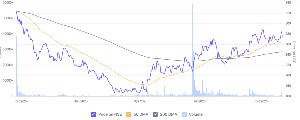
Northern ARC Capital Ltd (Chart source : https://www.screener.in)

In the chart above:

  • The blue line represents the price movement of the stock on NSE.
  • The orange line is the 50-Day Moving Average (50-DMA) — short- to mid-term trend indicator.
  • The grey line is the 200-Day Moving Average (200-DMA) — long-term trend indicator.
  • The light blue bars show the trading volume.

Observations

  1. October 2024 – March 2025:
    The stock remained in a downtrend, with the 50-DMA below the 200-DMA — a bearish phase. Prices continued to decline as momentum weakened.
  2. April – June 2025:
    The price started recovering, forming higher lows. The 50-DMA began to turn upward, indicating strengthening short-term momentum.
  3. June – July 2025: The Golden Cross
    The 50-DMA crossed above the 200-DMA, forming a Golden Cross — a bullish signal suggesting a potential long-term uptrend was beginning.
    This crossover was also supported by a spike in trading volume, adding credibility to the move.
  4. August – October 2025:
    After the crossover, prices continued to trend upward, confirming the bullish reversal.

Summary

  • A Moving Average helps visualize the trend by averaging prices over time.
  • The 50-DMA tracks short- to mid-term momentum, while the 200-DMA tracks long-term direction.
  • Golden Cross → Bullish trend may be forming.
  • Death Cross → Bearish trend may be developing.
  • Always confirm signals using other indicators (RSI, MACD, Volume) before making trading decisions as the Golden Cross is a lagging indicator; it confirms a trend that has already begun rather than predicting one.

Quick Insight: RSI and MACD

Relative Strength Index (RSI):
A momentum indicator that measures the speed and magnitude of price changes.

  • RSI ranges from 0 to 100
  • Above 70 → overbought (potential pullback)
  • Below 30 → oversold (potential rebound)

Moving Average Convergence Divergence (MACD):

A trend-following momentum indicator that shows the relationship between two moving averages of a stock’s price.

  • MACD line crossing above the Signal line → bullish signal
  • MACD line crossing below the Signal line → bearish signal

These indicators help traders confirm whether a Golden Cross or Death Cross is supported by momentum strength or weakness.

Your Turn

Have you ever used moving averages to identify entry or exit points in your trades?
What signals or confirmations do you rely on most — the crossover itself, volume trends, or other indicators?

Understanding Credit Score in India: A Complete Guide

In today’s consumer-driven market, the desire to own the latest products often surpasses income levels, making consumer credit an essential tool for fulfilling aspirations. However, securing credit from banks hinges on having a good credit score—a vital indicator of financial health.

In India, four credit bureaus approved by the Reserve Bank of India (RBI)—CIBIL, Experian, CRIF High Mark, and Equifax—assign credit scores to individuals based on their financial behavior and credit history.


What is a Credit Score?

A credit score is a three-digit number, typically ranging from 300 to 900 in India, that reflects an individual’s creditworthiness. It is calculated based on factors such as credit history, repayment behavior, and financial habits.

Score Ranges:

  • 750 and Above: Excellent – Higher chances of loan approval with favorable terms.
  • 650–749: Good – May qualify for credit, but not always at the best interest rates.
  • 550–649: Average – Higher likelihood of rejection or unfavorable loan terms.
  • Below 550: Poor – Indicates significant risk to lenders.

Factors Affecting Credit Scores

  1. Credit Composition
    Maintaining a diverse mix of credit accounts, such as car loans, credit cards, and housing loans, can positively impact your credit score. It demonstrates your ability to manage different types of credit products effectively.
  2. Payment History
    A consistent record of on-time payments is the most critical factor influencing your credit score. Late or missed payments can significantly harm your creditworthiness.
  3. Credit Utilization
    This reflects how much of your available credit limit you are using.
    • High utilization such as using 90% of your credit limit—signals a stretched financial position and negatively impacts your score.
    • Aim to keep your utilization ratio below 30% to maintain a healthy credit profile.
  4. New Credit Accounts
    Opening multiple new credit accounts or having frequent credit inquiries in a short period may signal financial risk and lower your score. Be cautious and strategic when applying for new credit.

Key Insights for Improving or Maintaining a Good Credit Score

i. Monitor Your Credit Report Regularly

  • Errors in your credit report, such as incorrect defaults or unauthorized accounts, can negatively impact your score.
  • Regularly review your report from credit bureaus like CIBIL, Experian, Equifax, or CRIF High Mark.

ii. Pay Your Bills on Time

  • Late payments on loans, credit cards, or utility bills significantly affect your score.
  • Setting up automated payments can ensure consistent on-time payments.

iii. Manage Credit Utilization

  • Keep your credit utilization ratio below 30% of your total credit limit.
  • Regularly pay off credit card balances to reduce utilization and boost your score.

iv. Avoid Excessive Credit Inquiries

  • Each loan or credit card application results in a “hard inquiry,” which can temporarily lower your score.
  • Space out credit applications and avoid applying for multiple accounts at once.

v. Maintain a Long Credit History

  • The length of your credit history impacts your score. Keeping older accounts active can be beneficial.
  • Avoid closing old credit cards unless absolutely necessary.

Factors That Don’t Affect Credit Scores

  • Savings Accounts or Fixed Deposits: These are not part of your credit profile.
  • Income Level: A credit score reflects financial behavior, not income.
  • Soft Inquiries: Checking your own credit score does not negatively impact it.

Insights for Young Professionals and Students

  • Start early by applying for a small credit card or loan to build a credit history.
  • Use secured credit cards (backed by fixed deposits) to establish credit if you’re just starting out.
  • Always pay your dues in full to avoid the temptation of carrying balances forward.

Final Thoughts

Your credit score is a reflection of your financial habits. By understanding the factors that influence your score and following these strategies, you can build a strong credit profile. A good credit score ensures access to financial opportunities and lays the foundation for a secure financial future

The Economics of Shrinkflation Explained: Parle G’s Case

Do you remember good old days when you could buy a 100 gm Parle G biscuit for ₹ 4 in 1990s. You must be wondering that today one can still buy a small pack of Parle G for just of ₹ 5, just ₹ 1 (25%) increase in more than 30 years. However, beauty lies in details. Although price has increased by just ₹ 1 in 30 years, the packet weight has been reduced to half at 50 gm.

The Parle G example is a fascinating case of “shrinkflation,” where companies keep the price of a product relatively stable but reduce the quantity or size. By reducing the weight but keeping the price almost the same, they have managed to preserve a nostalgic appeal for generations of customers who remember it as an affordable, everyday treat.

How shrinkflation helps companies manage inflation and customer perception:

Shrinkflation also allows companies to adapt to rising input costs while minimizing the shock for consumers. It’s a clever balancing act, ensuring that the brand remains affordable and accessible without significantly altering the perceived value. Over time, though, it does affect value for money, and observant consumers might feel a shift in their purchasing power even without clear price hikes.

By keeping the price stable but reducing quantity, brands like Parle G can maintain their presence as a staple in the market. Consumers don’t immediately notice the change in weight, so the brand retains its “low-cost” identity. However, for those who keep track, it’s clear that while the product is still inexpensive, the value per gram has subtly shifted over the years.

Ethical considerations:

When companies quietly reduce product sizes, they risk eroding trust among consumers who recognize that the price per gram is increasing. However, the gradual reduction in quantity can feel misleading, especially for observant consumers who realize that the value per gram has decreased. This can give the impression of manipulation, as customers end up paying more per unit over time without the transparency of a straightforward price hike.

In essence, shrinkflation may be a practical response to inflationary pressures, but its ethical standing depends on how transparent brands are about these changes. When done subtly and without clear communication, it risks creating distrust among loyal customers who may feel that they’re receiving less value than they used to. However, it is effective in keeping products accessible and in avoiding the “sticker shock” of a direct price increase, especially for those who may prioritize price over quantity.

Conclusion:

In the end, shrinkflation works as a business strategy but must be approached with sensitivity to customer perception. Balancing strategic pricing with honest communication can help companies navigate economic pressures without compromising trust.

Why Hyundai Motor India’s IPO Didn’t Attract Retail Investors?

Hyundai Motor India’s IPO, the largest in India’s history, was subscribed 2.37 times on the final day, mainly driven by qualified institutional buyers (QIBs). Retail and non-institutional investors showed significantly less enthusiasm, subscribing to only 50% and 60% of their allotted shares, respectively. This tepid response from retail investors can be attributed to several key factors:

  1. High Valuation: Although Hyundai’s price band was aligned with competitors like Maruti Suzuki, many retail investors found the pricing expensive, with little room for listing gains. The stock’s price-to-earnings ratio and overall valuation appeared unattractive, especially in the context of broader market uncertainty. This sentiment is reflected in the Hyundai IPO’s grey market premium (GMP), which initially made a high of ₹ 570 but dropped to ₹0 by 17th October. The sharp decline in GMP indicated fading expectations for immediate post-listing profits, further dampening enthusiasm among retail investors, who are often drawn to IPOs with short-term gains potential.
  2. Offer for Sale (OFS): Since the IPO was an offer for sale (OFS), it meant that the existing promoters were selling their stake rather than raising new capital for growth. Investors often prefer fresh issues that inject capital into the company for future expansion, which wasn’t the case here. The lack of fresh funds for growth-oriented initiatives could have contributed to the lukewarm reception.
  3. Market Volatility and Economic Concerns: Given the current economic uncertainties, including inflationary pressures, global slowdown concerns, and geopolitical issues, retail investors may have been hesitant to commit to new investments, especially in large-ticket IPOs.
  4. Automotive Industry Headwinds: While Hyundai maintains a strong market position, particularly in the SUV segment, the broader automotive industry is grappling with several challenges. Slowing sales, rising unsold inventory at dealerships, and increasing competition from electric vehicles (EVs) have created a cautious outlook. Moreover, long-term concerns over the future of internal combustion engine (ICE) vehicles amid growing regulatory and environmental pressures have added uncertainty to the industry’s trajectory. An example of this cautious sentiment comes from Bajaj Auto’s post-results earnings call, which highlighted the muted start to the festive season, traditionally a key period for auto sales in India. Bajaj Auto reported that sales growth during the festive season fell below expectations, with a projected increase of only 3-5%. Additionally, for the full fiscal year FY25, Bajaj Auto estimated domestic two-wheeler industry growth at a modest 5%, reflecting the headwinds the industry is facing. These broader sectoral struggles likely contributed to the cautious sentiment among retail investors in Hyundai’s IPO, as they weighed the risks of investing in a sector undergoing significant transformation.

In contrast, Qualified Institutional Buyers (QIBs) showed strong interest, subscribing heavily to the IPO. This reflects institutional confidence in Hyundai’s long-term potential, but retail investors appeared more focused on short-term risks and valuation concerns.

Understanding Asset Allocation for Investors

One of the key component of investment strategy for investors is allocation of their capital over various asset classes. Understanding of asset classes is important for allocation of capital as each asset class comes with it’s unique characteristics, risks, and potential returns.

Overview of Asset Classes:

  1. Equities (Stocks):
    • Represent ownership in a company.
    • Typically offer higher risk and reward (returns).
  2. Fixed Income Securities (Bonds):
    • Debt instruments where investors lend money to corporations or governments in exchange for periodic interest payments.
    • Generally offer lower risk and lower returns than equities .
    • Provide regular income, making them suitable for more conservative investors or those seeking stable income.
  3. Commodities:
    • Physical assets such as gold, oil, agricultural products, and metals.
    • Tend to act as a hedge against inflation and provide portfolio diversification.
    • Prices can be volatile due to supply and demand dynamics, geopolitical events, and economic factors.
  4. Cash and Cash Equivalents:
    • Include savings accounts, Treasury bills, money market funds, and short-term government bonds.
    • Highly liquid and low-risk, but offer lower returns, often below inflation rates.
    • Serve as a safe haven for capital preservation and short-term liquidity needs.
  5. Real Estate:
    • Investment in property such as land, residential, or commercial buildings.
    • Provides potential for steady income through rent and long-term appreciation in property value.
    • Can act as a hedge against inflation but may involve high initial costs, illiquidity, and location-specific risks.

Key takeaways on asset allocation:

  1. Equities:
    • High risk, high reward, and growth-oriented. Suitable for long-term capital appreciation but subject to market volatility.
  2. Fixed Income Securities (Bonds):
    • Lower risk, lower returns, and a source of regular income. Bonds act as a stabilizing force, especially in volatile markets. Sensitive to interest rate fluctuations.
  3. Commodities:
    • Provide diversification and inflation protection. Their prices are influenced by forces of global supply, demand, and geopolitical factors, offering opportunities in times of economic uncertainty. They often perform well when other asset classes (like equities) are underperforming, especially during inflationary periods. For example, gold typically rises during economic uncertainty or currency devaluation.
  4. Cash and Cash Equivalents:
    • Highly liquid and low-risk, but with minimal returns. Best used for short-term needs and as a liquidity cushion. Overexposure can lead to erosion of purchasing power over time because of inflation.
  5. Real Estate:
    • Offers income through rent and the potential for appreciation. However, it carries risks like illiquidity and regional market volatility. REITs offer a more liquid way to gain exposure to real estate markets.

Asset Allocation Strategies:

  • Conservative Investors: Focus on stability and capital preservation. They prioritize bonds, cash, and conservative assets like real estate and gold.
  • Aggressive Investors: Aim for long-term growth, accepting short-term volatility. They tend to favor equities, commodities, and higher-risk real estate investments.
  • Moderate Investors: Strive for a balanced portfolio, mixing equities and bonds, with smaller allocations to real estate and commodities to manage risk and achieve steady growth.

Dynamic Asset Allocation:

Asset allocation is not static. It evolves based on changes in an investor’s life stage, goals, or market conditions. Younger investors, with a longer investment horizon, tend to favor equities, while those nearing retirement may shift towards fixed-income assets to ensure stability and income generation. Rebalancing portfolios over time ensures the asset mix aligns with changing risk tolerance and financial goals.

Final Thoughts:

An optimal asset allocation strategy allows investors to balance risk and reward effectively, while adjusting to market shifts and personal financial goals. Periodic review and rebalancing ensures that portfolios continue to meet the needs of investors at different stages of their financial journey.