Learn how to use price action, trading volume, and delivery ratio together to identify accumulation, distribution, and high-conviction market moves.
Why do some stocks rebound sharply after a steep fall, while others continue to decline?
Price and trading volume provide part of the answer, but they don’t reveal who is actually buying or selling. This is where the Delivery Ratio becomes a valuable indicator. It helps investors distinguish between short-term speculative trading and genuine investment activity, offering deeper insight into the conviction behind market moves.
Understanding Delivery Ratio
When analysing stocks, most investors focus on price movements and trading volume. While these indicators provide valuable insights, they don’t reveal the true intent behind market activity.
This is where the Delivery Ratio becomes an important tool.
The delivery ratio helps investors understand whether trading activity is driven by genuine investment interest or short-term speculation. By combining delivery ratio with price and volume analysis, investors can better judge the strength and sustainability of a market trend.
What is the Delivery Ratio?
The delivery ratio is the percentage of shares traded during a day that are actually transferred to buyers’ demat accounts for settlement.
In simple terms, it tells us how many shares were bought for holding rather than for intraday trading.
Formula
Delivery Ratio = (Deliverable Quantity ÷ Total Traded Quantity) × 100
Example
Suppose a stock trades 10 lakh shares during the day.
- Shares traded: 10,00,000
- Shares delivered to buyers: 7,50,000
Delivery Ratio = (7,50,000 ÷ 10,00,000) × 100 = 75%
This means that 75% of the traded shares were purchased for delivery, while the remaining 25% were likely intraday trades.
Why is the Delivery Ratio Important?
The delivery ratio provides insight into the quality of trading volume.
Two stocks may record identical trading volumes, but the one with the higher delivery ratio generally indicates stronger investor participation and conviction.
It helps investors:
- Distinguish between long-term investing and short-term speculation
- Identify possible accumulation or distribution by large investors
- Confirm the strength of a price breakout or breakdown
- Filter out false signals created by speculative trading
Interpreting the Delivery Ratio
1. High Volume + Low Delivery Ratio
A large number of shares are traded, but only a small percentage are taken for delivery.
What does it indicate?
- Most of the trading activity is likely intraday or speculative.
- Traders are buying and selling shares within the same trading session.
- High trading volume may create excitement, but it does not necessarily reflect strong investor conviction.
- Such price movements are often driven by short-term sentiment and can reverse quickly.
Example
A stock trades 1 crore shares, but only 20 lakh shares are delivered.
Delivery Ratio = 20%
This indicates that most of the day’s activity was speculative.
Key Interpretation
High trading activity + Low investor commitment = Speculative movement
2. High Volume + High Delivery Ratio
A large number of shares are traded, and a significant percentage are taken into investors’ demat accounts.
What does it indicate?
- Indicates strong buying or selling conviction.
- Investors are willing to hold their positions instead of exiting on the same day.
- If accompanied by a price increase, it may indicate accumulation by institutions or long-term investors, making the uptrend more reliable.
- If accompanied by a price decline, it may suggest distribution or sustained selling pressure.
Example
A stock trades 1 crore shares, and 75 lakh shares are delivered.
Delivery Ratio = 75%
This suggests that investors are willing to hold the stock.
Key Interpretation
High trading activity + High investor commitment = Strong conviction and a more sustainable trend
3. Low Volume + High Delivery Ratio
Trading volume is relatively low, but a high percentage of the traded shares are taken for delivery.
What does it indicate?
- Suggests quiet accumulation by long-term investors.
- Although overall participation is low, those buying the stock intend to hold it.
- Often observed during the early stages of an uptrend or while informed investors gradually build positions.
- The stock may remain range-bound until broader market participation increases.
- If the stock later breaks out with a sharp increase in volume, it strengthens the bullish case.
Example
A stock trades 10 lakh shares, and 8 lakh shares are delivered.
Delivery Ratio = 80%
This indicates that most buyers intend to hold the stock.
Key Interpretation
Low trading activity + High investor commitment = Quiet accumulation
4. Low Volume + Low Delivery Ratio
Trading volume is low, and only a small percentage of shares are taken for delivery.
What does it indicate?
- Reflects limited interest from both investors and traders.
- Neither long-term investors nor speculative traders are actively participating.
- Stocks with this combination often move sideways with low liquidity.
- Price movements generally lack momentum until fresh buying interest emerges.
Example
A stock trades 10 lakh shares, but only 2 lakh shares are delivered.
Delivery Ratio = 20%
This indicates weak participation from the market.
Key Interpretation
Low trading activity + Low investor commitment = Weak market interest
Disclaimer: The following case study is based on publicly available trading data and represents one possible interpretation of market behaviour. No single indicator can conclusively prove institutional buying or selling. Delivery ratio should always be analysed alongside price action, trading volume, and broader market context.
Case Study : Analyzing Delivery Ratio – Healthcare Global Enterprises (HCG)
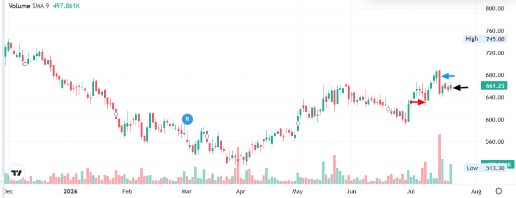
Red arrow – 8th July (-2.0% Price drop / Delivery 89.1%)
Blue arrow : 15th July (-5.8% Price drop / Delivery 86.7%)
Black arrow : 21st July (Delivery 94.4%)
How Delivery Ratio Revealed Institutional Accumulation
The table below shows the relationship between price movement, trading volume, and delivery percentage over multiple trading sessions.
| Date | Closing Price (₹) | Day Change (%) | Traded Quantity | Delivered Quantity | Delivery (%) | VWAP (₹) |
| 21 Jul 2026 | 661.25 | +1.1% | 9,73,199 | 9,18,322 | 94.4% | 655.65 |
| 20 Jul 2026 | 653.70 | -0.3% | 68,749 | 39,790 | 57.9% | 655.78 |
| 17 Jul 2026 | 655.85 | -0.6% | 75,511 | 44,222 | 58.6% | 655.88 |
| 16 Jul 2026 | 660.10 | +2.0% | 6,35,880 | 5,47,492 | 86.1% | — |
| 15 Jul 2026 | 646.85 | -5.8% | 19,51,000 | 16,91,517 | 86.7% | — |
| 14 Jul 2026 | 686.35 | +1.1% | 1,38,008 | 77,047 | 55.8% | 682.69 |
| 13 Jul 2026 | 678.85 | +1.9% | 1,48,464 | 84,657 | 57.0% | 676.38 |
| 10 Jul 2026 | 666.40 | +2.1% | 2,80,634 | 1,71,320 | 61.0% | 665.20 |
| 09 Jul 2026 | 652.70 | +2.9% | 1,12,110 | 58,297 | 52.0% | — |
| 08 Jul 2026 | 634.50 | -2.0% | 5,67,390 | 5,05,544 | 89.1% | — |
| 07 Jul 2026 | 647.65 | -0.8% | 4,07,040 | 3,32,551 | 81.7% | — |
| 06 Jul 2026 | 652.60 | -0.3% | 74,840 | 40,488 | 54.1% | — |
| 03 Jul 2026 | 654.80 | +0.9% | 1,14,870 | 69,151 | 60.2% | — |
| 02 Jul 2026 | 649.00 | +2.4% | 2,12,760 | 1,19,145 | 56.0% | — |
Key Takeaways From the Data:
One trading day stands out:
| Date | Price Change | Traded Quantity | Delivery % |
|---|---|---|---|
| 15 Jul 2026 | -5.8% | 19.5 lakh shares | 86.7% |
At first glance, many retail investors would consider this a bearish signal because the stock witnessed a sharp fall of nearly 6%.
However, a deeper analysis tells a different story.
Looking Beyond the Price
A sharp decline accompanied by very high trading volume usually attracts attention.
Many retail traders interpret this as a breakdown and panic sell.
Professional investors, however, often view these situations differently.
Periods of panic selling create liquidity—allowing institutions to accumulate large quantities of shares without significantly pushing prices higher.
Why This Data Suggests Accumulation
On 15 July, the stock experienced:
- Sharp price correction (-5.8%)
- Exceptionally high trading volume
- Very high delivery percentage (86.7%)
The high delivery percentage indicates that most of the traded shares were actually transferred to investors’ demat accounts rather than squared off as intraday trades.
This suggests that buyers were willing to hold the shares despite the sharp fall.
More importantly, the subsequent trading sessions strengthen this interpretation.
Following the decline:
- Delivery percentages remained consistently high.
- The stock stabilized near the ₹645–₹655 zone.
- Within a few trading sessions, the price recovered to ₹661.25, while delivery percentage increased further to 94.4%.
This combination suggests that the selling pressure was gradually absorbed by committed buyers.
Institutional Buying Often Happens During Fear
Institutional investors rarely chase stocks after a strong rally.
Instead, they often prefer buying during periods of fear when liquidity is abundant.
Rather than placing aggressive market orders, they may place large passive buy orders around important support levels.
As panic sellers exit, institutions quietly absorb the available supply.
Once the excess selling pressure is exhausted, prices often stabilize and recover.
This appears consistent with the pattern observed around the ₹645–₹655 price zone in this example.
Key Learning
A falling price combined with a high delivery percentage does not automatically mean a stock is bullish.
Instead, it indicates strong conviction among market participants.
To determine whether it represents accumulation or distribution, investors should analyse:
- Subsequent price action
- Trading volume
- Delivery percentage over several sessions
- Key support and resistance levels
In this case, the subsequent recovery in price and consistently high delivery percentages support the view that the decline was likely an accumulation phase rather than a continuation of bearish momentum.
Investor Takeaway
Price tells you what happened.
Volume tells you how much activity took place.
Delivery ratio tells you how much of that activity resulted in actual ownership.
When all three indicators are analysed together, they provide a much clearer picture of market sentiment than any one indicator alone. This is why experienced investors use the combination of price, volume, and delivery ratio to distinguish between panic selling, speculative trading, accumulation, and distribution.
Quick Takeaway
| Scenario | What It Suggests | Investor Focus |
|---|---|---|
| High Volume + High Delivery | Strong investor conviction | Confirm trend with price action |
| High Volume + Low Delivery | Mostly speculative activity | Be cautious of false breakouts |
| Low Volume + High Delivery | Quiet accumulation | Monitor for volume expansion and breakout |
| Low Volume + Low Delivery | Weak market interest | Avoid until participation improves |
Important Points to Remember
- A high delivery ratio does not always guarantee that the stock will rise. It simply indicates stronger holding interest.
- A low delivery ratio does not always imply weakness. It may simply reflect active intraday trading.
- Always interpret the delivery ratio in conjunction with price movement and trading volume.
- The delivery ratio is most useful when analysed over multiple trading sessions, rather than a single day.
- Compare the delivery ratio with the stock’s historical average to identify unusual accumulation or distribution.
Common Mistakes Investors Make
- Assuming a high delivery percentage is always bullish.
- Looking at only one day’s delivery data instead of analysing multiple sessions.
- Ignoring price action while interpreting delivery.
- Ignoring overall market trend.
- Taking trading decisions solely based on delivery ratio.
Delivery Ratio Checklist
Before taking a trading or investing decision, ask yourself:
✅ Is the stock trading near an important support or resistance?
✅ Has volume increased significantly?
✅ Is the delivery ratio above its historical average?
✅ Is price confirming accumulation or distribution?
✅ Is the broader market supporting the move?
If the answer is Yes to most of these questions, the delivery ratio provides much stronger confirmation.
Final Thoughts
Successful investing isn’t about relying on a single indicator—it’s about combining multiple pieces of evidence.
- Price tells you where the market is moving.
- Volume tells you how much participation there is.
- Delivery Ratio tells you how much conviction exists behind that participation.
When all three point in the same direction, investors gain greater confidence in identifying accumulation, distribution, breakouts, and potential trend reversals.
“Price creates the story, Volume gives it credibility, and Delivery Ratio reveals the conviction behind it.”
Use the delivery ratio not as a standalone signal, but as a confirmation tool alongside price action, trading volume, support and resistance, and broader market trends. Over time, this disciplined approach can help you make more informed and confident investment decisions.
 Learn-Do Finance